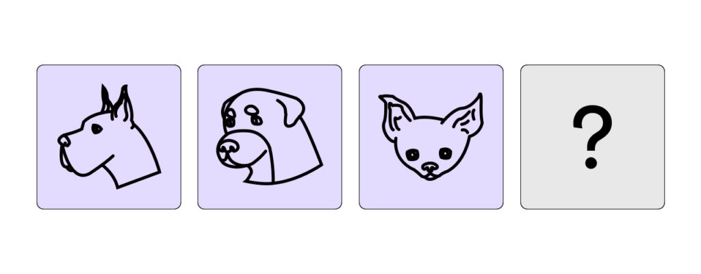
To understand the users of the Noun Project or similar icon search engines (aggregators), I came up with few questions and scenarios. Filtering out those who have experience with using an icon aggregator resulted a group of people who are in art/design industry. With the selected people, I proceeded the following questions and scenarios.
Questions
Q. When you’re using the Noun Project or similar icon search engines, how many icons are you mostly looking for?
- 82% answered they often look for more than a single icon
- 18% answered they look for just one icon
Q. If you are looking for multiple icons, do you prefer them to be created by one person/designer?
- 91% answered (Y) they prefer their icons to be created by one person/designer
- 9% answered (N) they don't particularly prefer icons to be created by one person/designer
Q. Please briefly describe why you picked Y/N for the previous question.
- Y: consistency, same/similar style, overall accordance, uniformity, common theme, "already have a specific icon in my mind"
- N: reference, "not for the right-away use"
Scenarios
S. You are looking for 2 icons: a dog and a cat. You found a dog icon that you like, but the creator’s collection only has icons of a dog. What would be your action?

- modify one of the icons from the collection so that it can look a bit like a cat
- I'd look for a cat icon from someone else that looks as similar as the dog icon I found
- I'd find a collection that has both dog and cat
- Give up the cat (if i have the budget, recruit a cat icon designer) ...
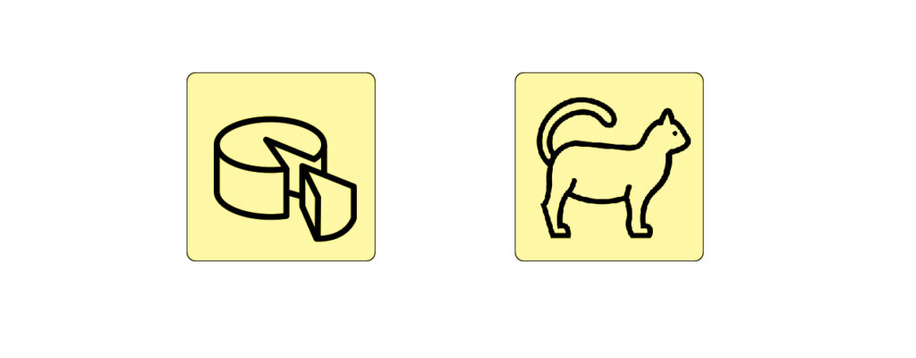
S. You are designing a website, and need 2 types of icons: a cake and a cat. Do you think this set of icons are good to be used together? Why?

- yes, they look same in style. Maybe the cat is too big?
- Yes. The two icons have used same background color and a line stroke.
- Yes, both in simple lines and fluffy.
- No, the porportion could be better (the cake smaller than the cat or the cat as face only) ...
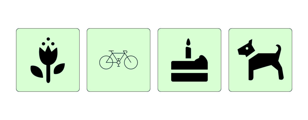
S. You are designing an app, and need 4 types of icons: flower, bicycle, cake and dog. Do you think this set of icons are good to be used together? Why?

- No, the bicycle icon is not designed like the others
- the bicycle looks too random with other ones
- No. The bike icon's line stroke is too thin compare to the other three.
- No, that bicycle looks off (less noticeable) with other icons ...
Next
- have more realistic/practical set of icons (such as doc, image, folder..etc that are often seen or will be used in product design) so the user scenarios can be smoothly understood
- make sure this is not about validating icon’s meaning
- focus on the main users of the Noun Project or of similar services (not the viewers of their final products)
- main topic moving away from perception of pictograms, but more towards expanding the possibility of collaboration inside an icon aggregator and improve its search experience
No Comments.